Thanks to all of you who have downloaded this plugin! Please consider leaving a rating and review, it would be really helpful to get your feedbacks. Thanks.
USING IONIC v1? CHECK OUT http://market.ionic.io/plugins/ion-numeric-keyboard

Plugin by icliclabs.com
This plugin is compatible with Ionic v2.x and v3.x!
Description
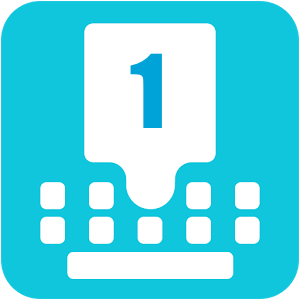
Ionic Numeric Keyboard is a gorgeous component allowing you to simulate a numeric keyboard without having to deal with a native (and painful) keyboard. The numeric keyboard is an easy-to-use directive similar to an ion-footer. You can easily customize the style or the content of each keys.
Test Before You Buy
You can test the app using Ionic View and enter the app id ** f82c8f6b**.
Features
- Works with iOS, Android and Windows Phone.
- Works great for passcode, SMS code validation, phone numbers, any numeric input in forms
- Easy to include in your existing app.
- The directive is very easy to use.
- The keyboard is highly customizable with just a few CSS lines.
- You can show/hide the keyboard easily.
- Compatible with your existing code.
- This component contains an easy to use directive. It comes with all 7 examples
- This component has well structured html, css and js files and is heavily commented, so that it is easy to edit, add your style, etc.
Installation
- Copy the app/components/ion-numeric-keyboard.ts into your app directory
- Import
IonNumericKeyboard component and add it to the declarations list in the app/app.module.ts file
That's all!
Usage
In your view, add inside the <ion-footer>: <ion-numeric-keyboard [visible]="isKeyboardVisible" [options]="keyboardOptions" (inkClick)="onClick($event)" (inkClose)="onClose($event)"></ion-numeric-keyboard>.
[visible] true to show the keyboard, false to hide it (false by default).[options] an object to set some options like the control keys, whether the keyboard is animated, etc. See examples in the .zip files.(inkClick) event when the user presses a key. See examples in the .zip files.(inkClose) event when the keyboard gets closed.
That's all. Here is an example of a view:
Simple example
basic.html
<ion-header>
  <ion-navbar positive>
    <ion-title>Passcode</ion-title>
  </ion-navbar>
</ion-header>

<ion-content class="passcode-example">
      ... your content goes here ...
</ion-content>

<ion-footer>
  <ion-numeric-keyboard [visible]="isKeyboardVisible" [options]="keyboardOptions" (inkClick)="onClick($event)"></ion-numeric-keyboard>
</ion-footer>
basic.ts
import {Component, ViewChild} from '@angular/core';
import {Content} from 'ionic-angular';
import {IonNumericKeyboard, IonNumericKeyboardOptions} from '../../../components/ion-numeric-keyboard'; //import

@Component({
  templateUrl: 'build/pages/examples/basickeyboard/basickeyboard.html',
  directives: [IonNumericKeyboard] // don't forget that line :)
})
export class BasicKeyboardPage {
  keyboardOptions: IonNumericKeyboardOptions;
  isKeyboardVisible: boolean = true; // keyboard visible by default
  @ViewChild(Content) content: Content; // that's how you retrieve the current ion-content
  passcode: string = '';

  ngOnInit() {
    this.keyboardOptions = {
      contentComponent: this.content, // mandatory, you have to pass the content reference
      rightControlKey: {
        type: 'icon', // could be 'icon' or 'text'
        value: 'backspace' // the icon name
      }
    }
  }

  // function called when a user clicks on the keyboard
  onClick(event) {
    console.log(event);
    if (event.source === 'RIGHT_CONTROL') {
      this.passcode = this.passcode.substr(0, this.passcode.length - 1);
    }
    else if (event.source === 'NUMERIC_KEY') {
      this.passcode += event.key;
      if (this.passcode.length == 4) {
        window.alert('Verifying passcode ' + this.passcode);
        this.passcode = '';
      }
    }
  }
}
Complex example
complex.html
<ion-header>
  <ion-navbar positive>
    <ion-title>Number</ion-title>
  </ion-navbar>
</ion-header>

<ion-content class="passcode-example">
  <ion-grid>
    <ion-row>
      <ion-col>
        <h4>Please enter a number:</h4>
        <h4>{{nb}}</h4>
      </ion-col>
    </ion-row>
    <ion-row>
      <ion-col>
        <button (click)="toggleKeyboard()">Toggle keyboard</button>
      </ion-col>
    </ion-row>
  </ion-grid>
</ion-content>
<ion-footer>
  <ion-numeric-keyboard [visible]="isKeyboardVisible" [options]="keyboardOptions" (inkClick)="onClick($event)" (inkClose)="onClose($event)"></ion-numeric-keyboard>
</ion-footer>
complex.ts
import {Component, ViewChild} from '@angular/core';
import {Content} from 'ionic-angular';
import {IonNumericKeyboard, IonNumericKeyboardOptions} from '../../../components/ion-numeric-keyboard';

@Component({
  templateUrl: 'build/pages/examples/slideupkeyboard/slideupkeyboard.html',
  directives: [IonNumericKeyboard]
})
export class SlideUpKeyboardPage {
  keyboardOptions: IonNumericKeyboardOptions;
  isKeyboardVisible: boolean = false; // keyboard hidden when opening the page
  @ViewChild(Content) content: Content;
  nb: string = '';

  ngOnInit() {
    this.keyboardOptions = {
      hideOnOutsideClick: true, // close the keyboard when the user clicks outside of the keyboard, unless the clicked element contains the class `ion-numeric-keyboard-source` or is contained in an element containing the class.
      animated: true, // we want the slide up/down animation
      contentComponent: this.content,
      leftControlKey: {
        type: 'text', //text left control key
        value: '.' // you can use whatever you want as a value (',', '+', etc)
      },
      rightControlKey: {
        type: 'icon',
        value: 'backspace'
      }
    }
  }

  // function called when a user clicks on the keyboard
  // implement your own validation here
  onClick(event) {
    if (event.source === 'LEFT_CONTROL') {
      if (this.nb.indexOf(event.key) === -1) {
        this.nb += event.key;
      }
    }
    else if (event.source === 'RIGHT_CONTROL') {
      this.nb = this.nb.substr(0, this.nb.length - 1);
    }
    else if (event.source === 'NUMERIC_KEY') {
      this.nb += event.key;
    }
  }

  // function called when the keyboard is closed because the user tapped outside
  onClose() {
    this.isKeyboardVisible = false;
  }

  toggleKeyboard() {
    this.isKeyboardVisible = !this.isKeyboardVisible;
  }
}
This component is structured, easy to customize and integrate into your Ionic app, BUT feel free to email me if you need any help.
Customization
Customizing this component is really easy. Here is how to change the color:
// here is how you can override the keyboard's default css
// --------------------------------------------------

/* BLACK KEYBOARD */
ion-numeric-keyboard.black-keyboard {
  ion-row ion-col.key {
    background-color: #333 !important;
    border-color: #444 !important;
    button {
      color: #fefefe !important;
    }
  }
  ion-row.ion-numeric-keyboard-top-bar,
  ion-row.ion-numeric-keyboard-top-bar ion-col.top-bar-key,
  ion-row ion-col.key.control-key {
    background-color: #242424 !important;
  }
}
/* END BLACK KEYBOARD */


/* FLAT KEYBOARD */
/* here is how you can remove the border around the keys */
ion-numeric-keyboard.flat-keyboard {
  ion-row ion-col.key {
    border: none !important;
  }
  ion-grid,
  ion-row.ion-numeric-keyboard-top-bar,
  ion-row.ion-numeric-keyboard-top-bar ion-col.top-bar-key,
  ion-row ion-col.key.key.control-key {
    background-color: #fff !important;
  }
}
/* END FLAT KEYBOARD */
You can apply a class to the ion-numeric-keyboard component.
Other Popular Plugins:
- Ionic Categories: Ionic v2.x/v3.x
- Ionic Passcode Square: Ionic v2.x/v3.x
- Ionic Passcode Flat: Ionic v2.x/v3.x
- Ionic Passcode Round: Ionic v2.x/v3.x
- Ionic Shrinking Header: Ionic v2.x/v3.x
- Ionic Material Sidemenu: Ionic v2.x/v3.x
- Ionic Walkthrough: Ionic v2.x/v3.x
- Ionic Contacts Inviter: Ionic v2.x/v3.x
- Ionic Cover Header: Ionic v1.x - Ionic v2.x/v3.x
- Ionic Profile Header: Ionic v2.x/v3.x
- Ionic Numeric Keyboard: Ionic v1.x - Ionic v2.x/v3.x
- Ionic Phone Number Validator: Ionic v1.x
- Ionic Cover Item: Ionic v1.x
- Ionic Timer: Ionic v1.x
Need Custom Work?
If you need help with your Ionic apps, if you need a specific plugin or integration. Let's get in touch. I'll be glad to develop or advise you for your app! Email me at icl1clabs@gmail.com.


